
Build responsive web layouts
Generate responsive designs that work across all devices, without the trial and error.
Generate responsive designs that work across all devices, without the trial and error.
Responsive layouts often behave unpredictably across viewport sizes. A three-column card grid that displays perfectly on desktop can become illegible on tablets, with text overflowing containers and navigation elements colliding. These layout failures typically surface during late-stage testing or, worse, in production.
The challenge isn't just making layouts work across different screen sizes. Predicting how flexbox, grid, and media queries interact across the full spectrum of devices requires experience that takes years to develop. Most developers handle responsive design through iteration: write base styles, add media queries for common breakpoints, test manually across devices, fix what breaks, then repeat. The process works but consumes significant time, and edge cases still slip through.
Most responsive design workflows rely on manual media query authoring, extensive device testing, and framework utilities that provide shortcuts but don't eliminate the underlying complexity.
You typically start with base styles, then add breakpoints at common device widths: 768px for tablets, 1024px for desktop, maybe 1440px for large screens. CSS media queries override properties at each breakpoint to adjust layouts, typography, and spacing.
1.container {
2  width: 100%;
3  padding: 1rem;
4}
5
6@media (min-width: 768px) {
7  .container {
8    padding: 2rem;
9  }
10}
11
12@media (min-width: 1024px) {
13  .container {
14    max-width: 1200px;
15    margin: 0 auto;
16  }
17}
This approach gives you precise control over layout behavior at specific viewport widths. However, choosing the right breakpoints requires understanding your specific content, not just generic device categories. A navigation menu might need a breakpoint at 920px because that's where menu items wrap, not because any device specification suggests it. Manual media queries also mean maintaining duplicate or overridden styles that become difficult to track across large stylesheets.
After implementing media queries, developers open browser dev tools and cycle through preset device sizes. Chrome DevTools offers responsive design mode with common device dimensions. Many teams also maintain collections of actual phones and tablets for real device testing, checking how layouts render across iOS Safari, Android Chrome, and various screen densities.
Browser simulators provide a useful approximation but don't perfectly replicate actual device behavior. Touch targets that seem adequate in desktop dev tools often feel cramped on real phones. Viewport height variations introduced by notches, dynamic toolbars, and soft keyboards can cause layout issues that simulators miss entirely. A fixed-position footer that looks fine in Chrome's device emulator might cover important content when the iOS Safari address bar expands.
Device testing catches many real-world rendering issues, but the process is time-consuming. Testing every layout change across six or eight devices adds friction to the development cycle, and it still can't catch every edge case across the hundreds of device and browser combinations users actually have.
Modern CSS frameworks like Bootstrap and Tailwind provide responsive class systems that abstract away media query logic. Developers add classes like col-md-6 or lg:flex-row that automatically apply styles at predefined breakpoints.
1<div class="grid grid-cols-1 lg:grid-cols-3 gap-4">
2  <div class="card">...</div>
3  <div class="card">...</div>
4  <div class="card">...</div>
5</div>
Framework utilities speed up development by providing consistent breakpoint conventions and pre-tested responsive patterns. However, they lock you into predefined breakpoint systems that may not align with specific design needs. A framework's tablet breakpoint might trigger at 768px when content actually needs adjustment at 850px. Customizing these breakpoints usually requires project-wide configuration changes that affect every responsive utility across the codebase.
Frameworks also abstract away the underlying CSS, which can make debugging layout issues more difficult. When a Tailwind layout breaks at a specific viewport width, understanding why requires translating utility classes back to their underlying CSS properties and understanding how those properties interact.
When layouts break, you open browser dev tools, switch to responsive design mode, and manually drag viewport width to find the exact pixel where things go wrong. They inspect elements, examine computed styles, and trace how parent container constraints affect child elements.
Browser dev tools are essential for responsive debugging, but finding the root cause of layout issues requires deep understanding of CSS specificity, the box model, and how flexbox or grid behaves under different constraints. A layout that overflows at 843px might not result from a single CSS rule but from the interplay of parent container widths, child element padding, and font-size calculations that only surface in combination.
This debugging process is iterative and can be tedious. Each fix requires re-testing across multiple viewport widths to ensure it doesn't introduce new issues elsewhere in the responsive range.
You can integrate AI into your responsive design workflow for immediate layout generation and systematic refactoring. Claude works in two ways depending on your needs:
Before spending hours hand-coding media queries or restructuring layouts, you can validate whether a design pattern adapts well across devices. Claude.ai provides immediate feedback that supports responsive design decisions during development rather than discovering broken layouts during testing or after release.
The Claude.ai web interface lets you describe layout requirements and receive working code with proper viewport meta tags, mobile-first CSS, and semantic HTML structure. This initial generation provides working examples of responsive patterns before customizing for specific project needs.
Common layout generation requests:
These requests provide working examples that demonstrate responsive techniques you can adapt to your projects.
Example request: "Create a product landing page with fixed header, hero section, three feature cards, and footer. Cards should display in a row on desktop and stack on mobile."
Claude.ai returns semantic HTML5 with responsive CSS that handles multiple viewport sizes. The generated code includes comments explaining breakpoint choices and layout decisions:
1<head>
2  <meta name="viewport" content="width=device-width, initial-scale=1.0">
3  <style>
4    .header {
5      position: fixed;
6      top: 0;
7      width: 100%;
8      background: #fff;
9      box-shadow: 0 2px 4px rgba(0,0,0,0.1);
10      z-index: 100;
11    }
12
13    .feature-grid {
14      display: grid;
15      grid-template-columns: 1fr;
16      gap: 2rem;
17      padding: 2rem 1rem;
18    }
19
20    /* Tablet and up: 2 columns */
21    @media (min-width: 768px) {
22      .feature-grid {
23        grid-template-columns: repeat(2, 1fr);
24        padding: 3rem 2rem;
25      }
26    }
27
28    /* Desktop: 3 columns */
29    @media (min-width: 1024px) {
30      .feature-grid {
31        grid-template-columns: repeat(3, 1fr);
32        padding: 4rem 2rem;
33      }
34    }
35  </style>
36</head>
Beyond code generation, you can ask Claude.ai to explain why specific approaches work for responsive layouts.
Try: "Why use flexbox with flex-wrap instead of CSS Grid for this navigation?"
Claude.ai breaks down trade-offs between different layout methods, explaining browser support considerations, layout flexibility, and when each approach makes sense for specific use cases. This builds understanding of the underlying principles rather than just copying patterns.
When responsive issues span multiple stylesheets or affect an entire application, Claude Code acts as a systematic refactoring partner. Unlike browser-based tools, Claude Code explores project file structure, identifies viewport-specific problems across multiple files, and proposes fixes that maintain existing architecture.
Installation:
npm install -g @anthropic-ai/claude-codeLaunch in your project:
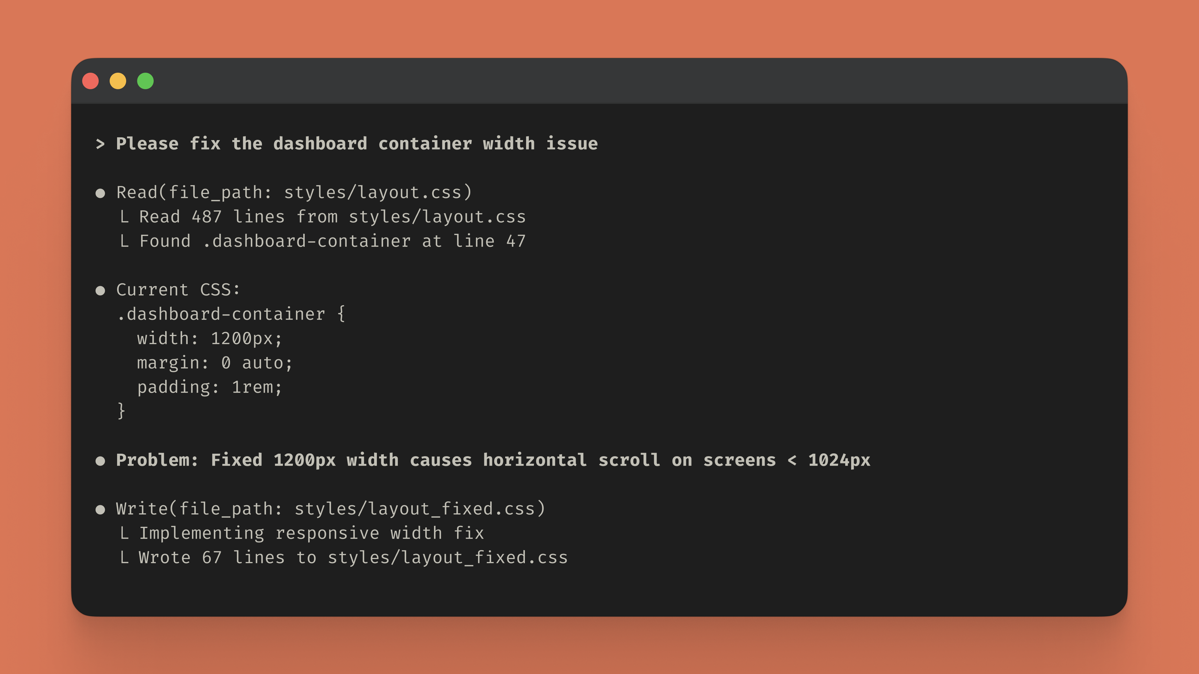
claudeConsider a product dashboard that breaks on tablet viewports. Navigation overlaps content, cards don't reflow properly, and the sidebar pushes main content off-screen. Here's how Claude Code handles the investigation, from audit to fixing:
Claude Code scans layout.css to identify fixed-width styles and layout patterns that cause overflow on smaller screens, finding 3 specific issues with line numbers and recommendations.

It then updates the CSS by replacing fixed widths with responsive alternatives (max-width, flex basis, grid-template-columns with auto-fit), adding media queries for breakpoint-specific adjustments.
The code then tests the updated styles at viewport sizes 320px and 512px to confirm there's no horizontal overflow and the layout responds correctly at each breakpoint.

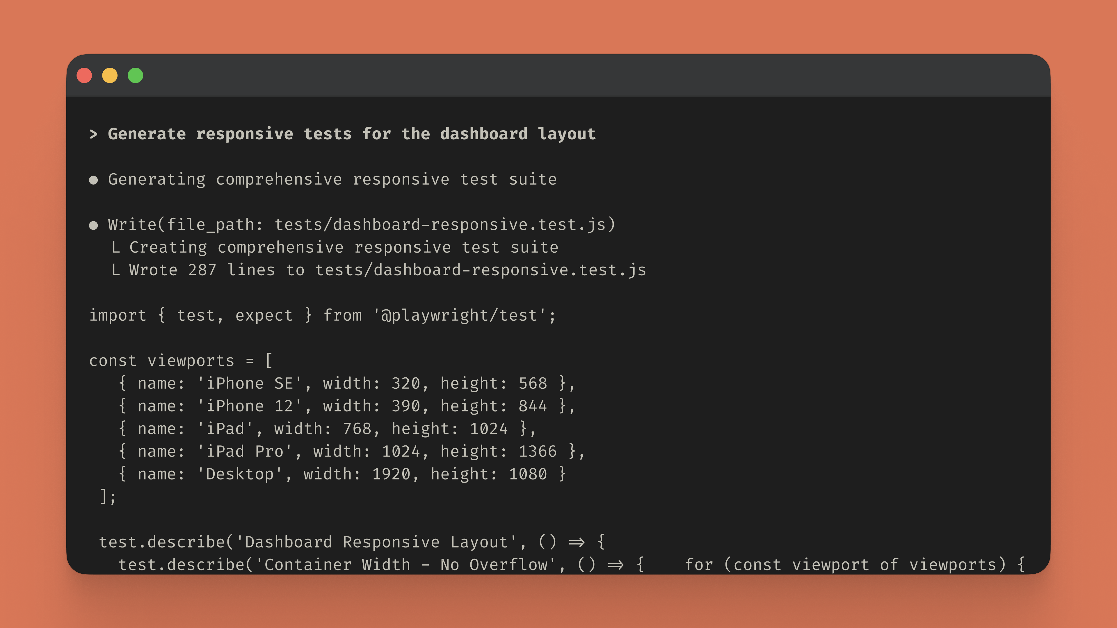
Finally, Claude Code generates a comprehensive Playwright test suite that validates responsive behavior across real device sizes (iPhone SE, iPhone 12, iPad, iPad Pro, Desktop) to prevent future regressions.
Quick prototyping: Visit Claude.ai to generate responsive layouts and learn design patterns without any setup. Describe your layout requirements—like a three-column card grid that stacks on mobile—and receive complete HTML and CSS with proper viewport configuration and media queries. It's ideal for understanding responsive techniques and creating boilerplate code you can adapt to your projects.
Codebase refactoring: When responsive issues span multiple stylesheets or affect your entire application, install Claude Code to systematically analyze and fix layout problems across your project:
npm install -g @anthropic-ai/claude-codeOnce installed, describe the layout issues you're facing and Claude Code scans your stylesheets, identifies viewport-specific problems, and implements targeted fixes directly in your files. It handles the systematic refactoring work while you focus on building features.
Stop guessing at breakpoints and testing layouts manually across dozens of devices. Whether you're learning responsive patterns or refactoring an existing codebase, Claude helps you build layouts that work predictably across every viewport.

Get the developer newsletter
Product updates, how-tos, community spotlights, and more. Delivered monthly to your inbox.


